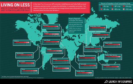
Millions of people around the world live on a few dollars a day. Even in the wealthiest of countries, some populations experience the greatest disparity. This graph, available at Good.is shows what percentage of a country’s population is living on <$10 and >$10. It is disconcerting that no Caribbean countries were included.
A larger graph is available at http://awesome.good.is/transparency/web/1106/global-poverty/flash.html

